SIH On Brand
For the first time in nearly a quarter century, we’re proud to unveil a new brand for SIH. It was time.
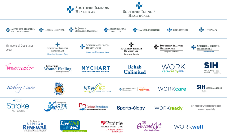
Over the last 25 years, we have grown into a much larger and more advanced network of providers, facilities and services. During that time, we’ve adopted a number of secondary logos and naming conventions. The results have been confusing. Many Southern Illinoisans don’t know what was – and wasn’t – SIH. A logo mark is only part of a brand, mind you. But we weren't making things easy on any one trying to discern who was doing what where.
See what we mean:
Our new brand and logo are deeply rooted in our mission to promote the health and well-being of all people in the communities we serve. As a not-for-profit healthcare system, we hold our mission and values close to heart along with a commitment to provide care to all patients regardless of their ability to pay.
Our name is not changing, nor does our purpose and commitment to quality care, delivered locally by skilled and compassionate professionals. After all, brands should be reflective of deliverable promises. There's only so much we can say about this point, in this space – no matter how many words we use to describe anything about this recent re-branding work. Nevertheless, we want you to know that our purpose and our commitment to you and to quality care is a demonstrative one, and one we hope to carry out over time. Alongside of that commitment, what we do hope changes is how you might see all of us – connected to one another across a comprehensive network. The logo and the brand are simply reflective of a focus on unity and connection, which builds on the strong history of strength synonymous with SIH.